Inahara's Pharmacy is a very small pop-up retail experience that had its first event in October 2019 in Seattle, Washington.
It was started by Justin Inahara who wanted to connect his family's history with modern style. His grandfather owned and operated a pharmacy in Portland, Oregon for over 40 years, but never changed the name to his own. When Justin started the pop-up he wanted to use his family's name that they were never able to do in early post-WWII America.
The branding was inspired directly from the original sign at the family pharmacy, Seaton's, and modernized with updated typography and colors.
The original Seaton's Pharmacy, owned by the Inahara family, in Portland, Oregon
For the design, Justin wanted to have bold colors inspired by Japanese maekake aprons: dark blue, orange, and white. I wanted to incorporate Japanese patterns as well that could be used for marketing materials and social media.
Japanese patterns were used to connect with Justin's Japanese-American family.
Patterns and colors used inspired by Japanese maekake aprons
We also adapted the Inahara family crest to be a part of the branding, since it was such an important part of the Inahara Pharmacy story.
The Inahara family crest portrays the tachi omodaka, or the three-leaf arrowhead plant.
The pop-up itself was to sell a few different things that Justin has a lot of experience in: menswear, coffee, and Japanese home goods. The retail store Momo in Seattle's Japantown agreed to host the pop-up in a corner of their store for a month, and Inahara's Pharmacy started the month with a launch event.
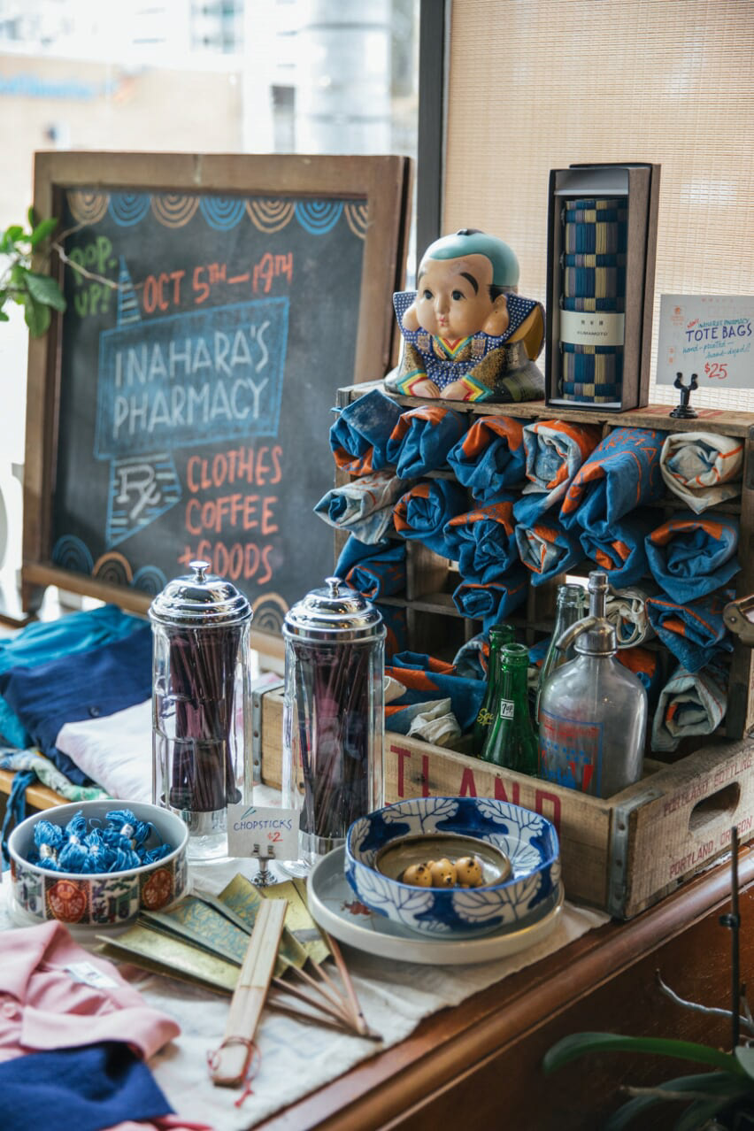
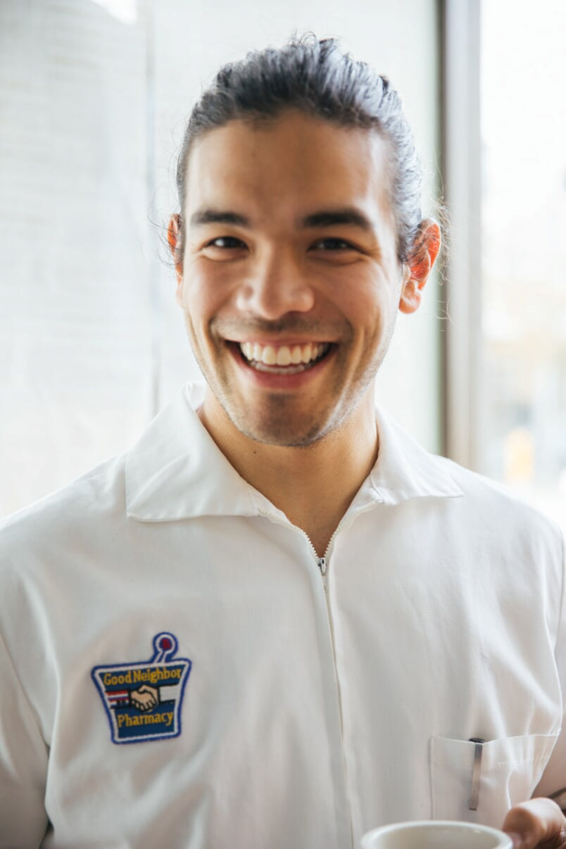
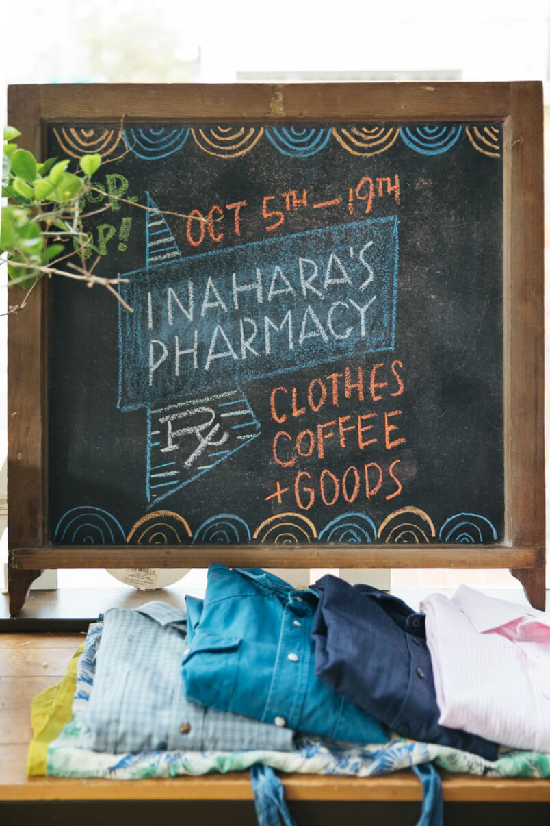

The pictures above are from the event itself, showing some of the goods for sale, Justin wearing his grandfather's pharmacy shirt, even chalkboard, and pour-over coffee being served.
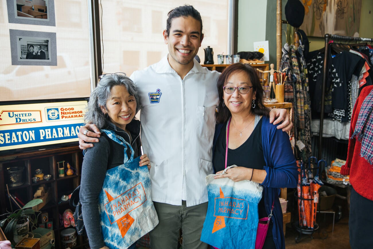
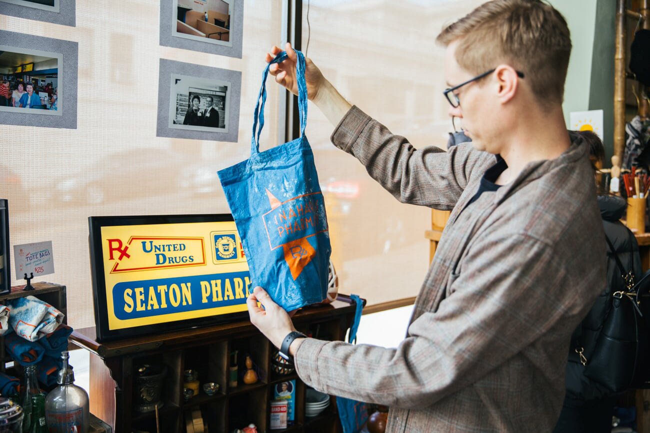
Justin hand-dyed bags with indigo for the event, and screen printed the Inahara's Pharmacy logo on the front in bright orange. Original signs from the pharmacy were brought up from Portland to accent the event.
(L) The original Seaton's Pharmacy, (C) Justin's grandparents Heidi & Yoshio at the pharmacy (R) Yoshio painting the outside of the pharmacy
Plans to hold another pop-up event were put on hold due to COVID-19 but hopefully will return in 2021.
3 pattern vectors were designed by "callmetak" on Vecteezy. Colors changed by me.